- Company Profile
-

(+61) 280113465
(+91) 03340624483
(+40) 745348765
(+1) 3603693187
(+1) 4387949227
-

-

The Latest Trends in Web Design Australia can expect in 2018
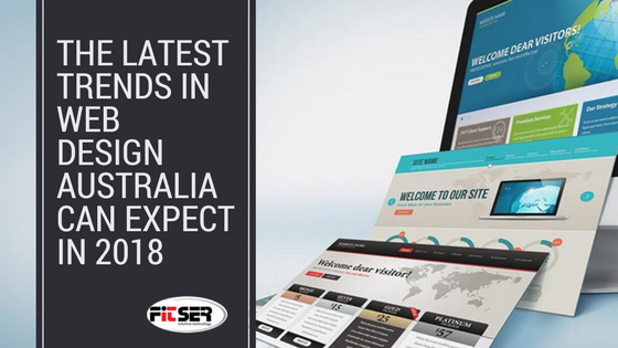
When we think of design, we think about presentation ability. When we think about web design, we automatically think out-of-the-box presentation ability. Truly, in the digital medium where unorthodox and unconventional design makes for better business marketing, the necessity to innovate persists always. Web design has seen tectonic shifts in trends and tactics in the last few years. 2018 aims to be no different in terms of upheavals in web design vogues.
- Shadowplay
A designer playing with transparency settings is not news, then why are we still concerned about it? To illustrate, we need to go back a few years when flat menu design was all the rage. In order to add visual panache, designers are now adding shadows and toying with transparency levels, in different sections of the layout. This way, the grid looks like a superficial layer of a fruit with many intricate screens peeking through the translucency.
- Colour play
Menus with vibrant colour gradients are making a comeback. In conjunction with flat colour menus, shadow effects are giving the users a three-dimensional feel of a palpable interface. Designers have coupled it with saturated colour schemes to give new website designs a neo-futuristic appearance. In the domain of web design Australia has seen some intuitive outputs from veteran designers like Fitser and a litany of web design companies. Vibrant colour effects catch the user’s eye as good as transition and hover effects, and their likes.
- Abstract animations
Designers are resorting to lightweight animations with the help of Javascript to add visual flavour to the website. These animations are low on resources and do not compromise on site loading times. Some of these landing page animations are in the motif of abstract fractals and particle waves that dazzle the user unawares. Sometimes cartoon graphics are incorporated to make the website design interactive and distinctive. If not for anything else, then at least the animations are guaranteed to fetch a whole lot of hits to the landing pages, creating a lasting impression.
- Mobile optimization
In the past, designers did not have to concern themselves with making sites mobile-friendly. Then with the advent of smart, handheld devices, the concern shifted to making the websites mobile-friendly, in a fashion that does not make the user experience too tedious on the smaller screen. Now, with the onset of roll-out menus, designers can breathe a sigh of relief. When it comes to web design Australia based enterprises are seeking designers such as Fitser for mobile-friendly site design solutions. Flat icon, animation effects and roll-out menus are de-facto mobile web design virtues for them now.
- Picture and text
As opposed to the yester-year trend of small, neat text passages, web designers have presently veering towards a design that makes use of bold typography, in curvy, retro fonts! Photos are also being replaced. Experienced designers are conjuring flat-color drawings that have usurped the screen space previously occupied by stock photographs. Visitor behaviour is the best judge of which trend stays and which one goes out the window. Presently they are hung up on the eye-candy side of the business, rather than the humdrum formality of the same.
close
